By Anne Maina, Maureen Kabasa
Climate change is no longer a distant threat it is a reality that people all over the world are having to grapple with every day. The Intergovernmental Panel on Climate Change (IPCC) Sixth Assessment Report notes that issues ranging from rising sea levels, dwindling fresh water resources, unpredictable weather patterns and the underlying socio-economic disruptions highlight the undeniable need for adaptation measures to climate change.
Various tools and technologies exist that have been used by researchers, climate advocates, policymakers and governments across the globe but what stands out is the ability to convert all the jargon to intricate pieces of information and visualization that drives the message across. For instance, the NASA Center for Climate Simulation offers CREATE-V, an interactive tool that visualizes reanalysis data to facilitate climate change investigation. It aids in understanding complex climate data through interactive visualizations. Data storytelling is the answer!
Recently, I had the privilege of participating in a conversation hosted by Zindua School on X Space, titled “The Art of Data Storytelling: Turning Insights into Impact“. As a researcher at the African Center for Development Studies (ACTS) I can appreciate the significance of the discussion which explored how data storytelling transforms raw data into compelling narratives that drive understanding, engagement, and action. This blog delves into this approach as a game-changer in climate adaptation and promoting resilience.
Data storytelling
Correlation One in their article on the ‘Power of Data Storytelling’, define data storytelling as more than just presenting facts and figures but it is the art of weaving data into a compelling narrative that informs, inspires, and drives action. In the context of climate adaptation, it involves taking complex datasets, ranging from temperature trends and sea-level rise to disaster risks, and transforming them into accessible, relatable stories that resonate with diverse audiences.
The tools and techniques available include; visualizations such as climate models, GIS maps and time-series graphs; infographics which are simplified visual data summaries for quick understanding; interactive tools like dashboards or simulations that explore the ‘what-if’ scenarios; and narrative case studies which in this case can be stories of successful adaptation efforts. For instance the National Oceanic and Atmospheric Administration (NOAA) offers Data Snapshots, a collection of simplified climate maps with plain language descriptions. These resources make complex climate data more accessible to the public.
Simplifying Complexity
Climate data is essentially complex. It is multi and inter-disciplinary running from meteorology, and hydrology, to socio-economics among others, and it involves massive datasets. For policymakers, community leaders, and even the ‘wanjiku’, meaning the general underrepresented public, this complexity can be overwhelming and in most cases, the information is ignored and termed as ‘hii ni ya watu wamesoma, maPhD’ translating to ‘this is for educated people, PhDs’. Data storytelling simplifies these details by combining clear visuals, narratives, and actionable insights.
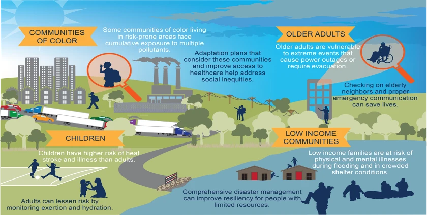
For instance, instead of presenting a table of rising global temperatures, a well-crafted infographic might show how a 2°C rise impacts agriculture, water resources, and human health. More so systems such as the Climate Data Management Services Division (CDMS) of the Kenya Meteorological Department manages the ENACTS (Enhancing National Climate Services) map-rooms which is a dedicated web portal providing 24/7 access to climate information services, offering visualizations that merge station data with satellite estimates. By distilling data into digestible formats, storytelling ensures the message is heard and understood.
Driving Awareness and Engagement
One key takeaway from the Zindua School conversation was the power of storytelling to connect data with human experiences. People are likely to engage with stories that reflect their realities or aspirations.
Imagine a coastal community in Mombasa County which is a low-lying coastal area, grappling with flooding due to rising sea levels. A data-driven story could combine satellite imagery, historical flood data, and personal accounts from affected residents. This information woven well represents facts and emotion too creating a narrative that is both informative and compelling, sparking conversations and mobilizing action.
Informing Decision-Making
Evidence-based decisions drive effective and actual climate adaptation. Yet, decision-makers often lack the time or expertise to analyze raw data. Data storytelling bridges this gap by presenting insights in a way that is accessible and actionable. Resources such as the World Bank’s Climate Change Knowledge Portal offers detailed climatology data for Kenya, covering the period from 1991 to 2020. Visitors to the site can visualize data through spatial variations, seasonal cycles, or time series analyses. This resource aids in building a comprehensive understanding of Kenya’s current climate conditions and future scenarios
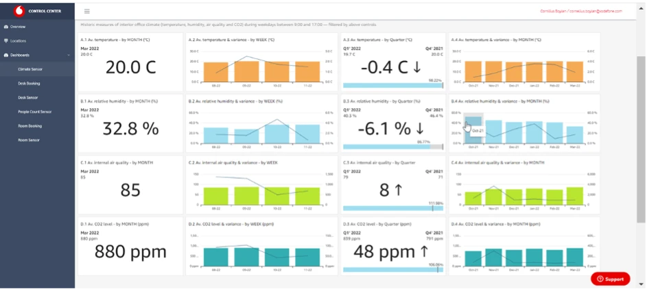
Interactive tools like dashboards and scenario-based models are instrumental here. Dashboards are a type of graphical user interface (GUI) that often provide at-a-glance views of data that is relevant to a certain objective or process following a combination of visualizations and summary information (Wikipedia). They allow policymakers to visualize potential outcomes, such as the impact of implementing green infrastructure versus maintaining the status quo or the impact of offering green jobs and training to women and youth in marginalized areas. By making data interactive and engaging, storytelling empowers leaders to prioritize interventions that yield the greatest benefits.
Empowering Communities
The involvement of local communities is imperative in driving successful climate adaptation efforts. Data storytelling plays a critical role in translating technical jargon into relatable tales that resonate with resident populations. A nomad in the Rift Valley would fail to understand what the X and Y’s on a plot map mean or a fisherman in Kilifi County an equation calculating the proximate composition and mineral content in seaweed. That is pure jargon to them and just numbers and letters on a screen or piece of paper.
There by, linking data to tangible benefits, storytelling fosters a sense of ownership and encourages grassroots participation. For example, a community-facing campaign might use story maps to show how tree planting can reduce urban heat islands in their region.
Fostering Collaboration
Climate adaptation requires collaboration across sectors and stakeholders. A famous quote by Mother Teresa says, ‘I can do things you cannot, you can do things I cannot; together we can do great things’. During the X Space conversation, we discussed how data storytelling acts as a unifying language, aligning diverse groups around shared goals where everyone has a clear understanding of the process and feels heard.
Whether it is a non-profit seeking funding for a project or a government body rallying public support, a well-told data story can build consensus. Case studies of successful adaptation efforts, backed by data, inspire confidence and encourage investment.
Advocacy and Policy Influence
One of the most impactful aspects of data storytelling is its ability to influence policy. Advocacy organizations often use data-driven narratives to highlight the urgency of climate adaptation and push for systemic change. For instance, putting side by side the cost of inaction with the benefits of proactive measures in a visually striking way can sway decision-makers. As highlighted during the Zindua School conversation, storytelling can transform data into a rallying cry for change.
Conclusion
Data storytelling is more than a communication tool; it’s a catalyst for action. By simplifying complexity, driving engagement, informing decisions, empowering communities, fostering collaboration, and influencing policy, it turns insights into impact.
The insights shared during the Zindua School conversation among other discussions reinforce the critical role of storytelling in addressing the climate crisis and the overall environmental management. As we navigate an uncertain future, let us harness the power of data storytelling to inspire collective action and build a more resilient world.
What stories will you tell to drive change?
References
- Correlation One. (2023, July 21). The power of data storytelling: Transforming data into impactful narratives. Correlation One. Retrieved from https://www.correlation-one.com/blog/data-storytelling
- Intergovernmental Panel on Climate Change (IPCC). (2021). Climate change 2021: The physical science basis. Contribution of Working Group I to the Sixth Assessment Report of the Intergovernmental Panel on Climate Change. Cambridge University Press. https://www.ipcc.ch/report/ar6/wg1/
- Kenya Meteorological Department. Climate data management services. Kenya Meteorological Department. Retrieved from https://meteo.go.ke/services/climate-data-management-services
- NASA Center for Climate Simulation. CREATE-V. NASA. Retrieved from https://www.nccs.nasa.gov/services/analytics/create-v
- National Oceanic and Atmospheric Administration. (n.d.). Data Snapshots. NOAA Climate.gov. Retrieved from https://www.climate.gov/maps-data/data-snapshots
- World Bank. Kenya: Climate data – historical. Climate Change Knowledge Portal. Retrieved from https://climateknowledgeportal.worldbank.org/country/kenya/climate-data-historical